General structure and functions
General structure and functions
The basic structure of an ADIB portal is shown in the following illustration:
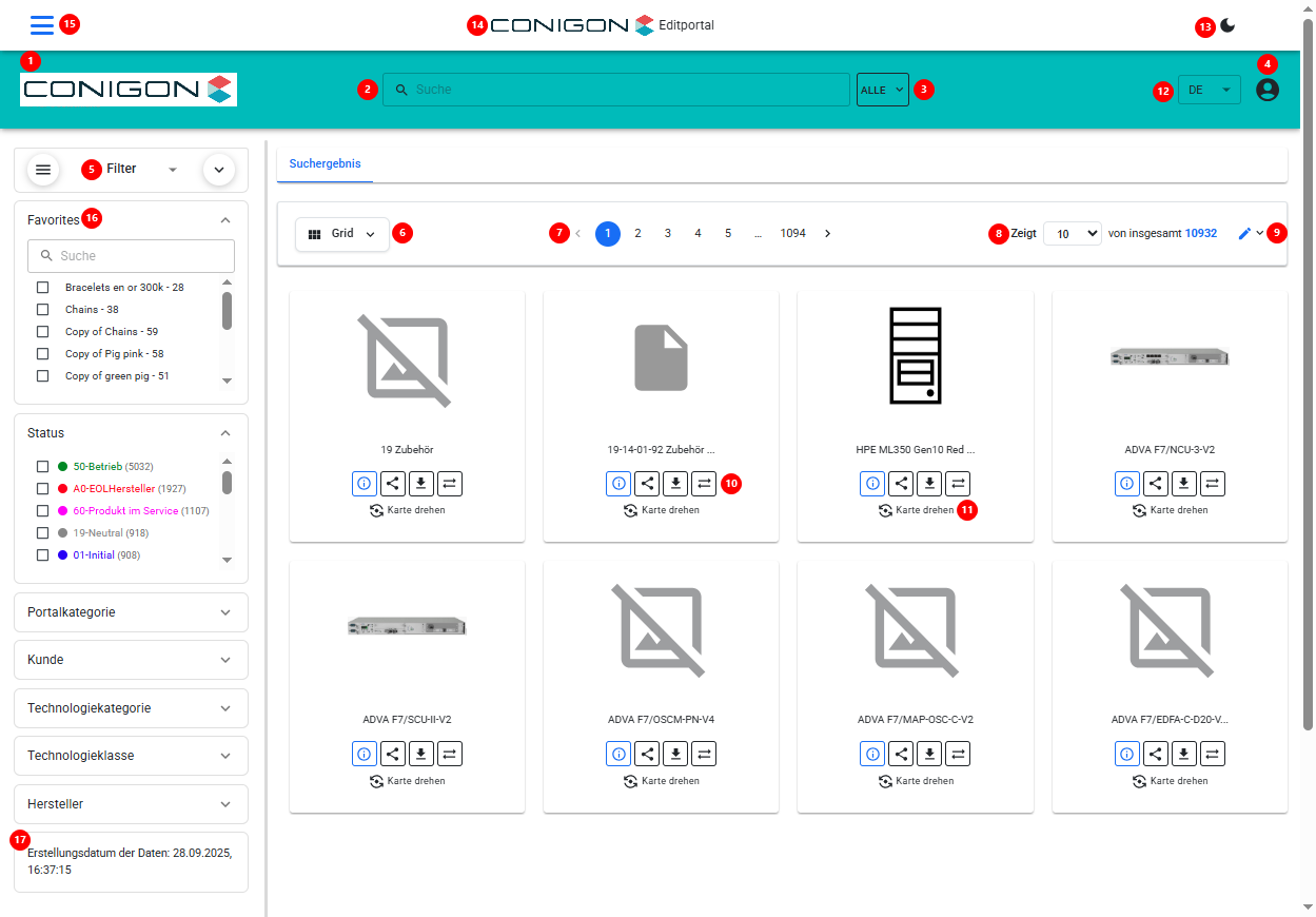
In the explanations below, we refer to the individual elements introduced here:
- (1) Logo
- This is an image file (jpg or png) that can be configured via the CentralStation.
- (2) Free-text Search
- Used to search for items (e.g., products) present in the current portal.
- The search can be configured flexibly, for example:
- whether search suggestions should appear
- which fields to search in
- whether to match whole words only or also partial matches
- The search can be configured flexibly, for example:
- Used to search for items (e.g., products) present in the current portal.
- (3) Search Field Selector
- Used to restrict the search to a specific field.
- The user can specify that they want to search only within a particular field.
- On click, a list opens. The entries in this list are defined in the CentralStation (by setting the “SEARCH” property on the Step-Positions—details below).
- The user can specify that they want to search only within a particular field.
- Used to restrict the search to a specific field.
- (4) User Menu
- Provides access to, among other things:
- Share table (if configured)
- Shopping cart (if configured)
- Comparison list
- Download table
- Excel import (only for an Edit Portal and if configured)
- Logging data (“Edit-Logs”) (only for an Edit Portal and if configured)
- Template Designer – for dynamically generated PDF templates
- Settings (e.g., language selection and user login), if the portal is configured accordingly
- Provides access to, among other things:
- (5) Filter Menu via Facets or Tree View
- Facets are generated automatically for fields to which the “FACET” property has been assigned on the Step-Positions (details below).
- The user can hide the entire filter panel or close individual facets via the icons.
- Tree view displays a hierarchical view of the data model.
- Facets are generated automatically for fields to which the “FACET” property has been assigned on the Step-Positions (details below).
- (6) Search Results View
- The user can choose how to display the results of the search (free-text search or filter facets).
- In portal configuration via CentralStation, you define which views are available and which is the default. Available views:
- Grid View (“GRID”): products are shown in a grid (this is selected in the screenshot).
- List View (“LIST”): products are shown as list items (one per row).
- Table View (“TABLE”): products are shown in a table.
- Flexible View (“FLEXIBLE”): products are shown in a table, but the user can define which columns to display.
- In configuration, you can specify for each field whether it should appear in each view.
- (7) Pagination (Top)
- In portal configuration, you choose whether pagination appears at the top, bottom, or both.
- (8) Number of Items / Products and Definition of Items to Display. Displays how many items/products are available and allows setting how many to show per page, etc.
- In portal configuration, you choose whether pagination appears at the top, bottom, or both.
- (9) Enable Edit Mode
- If the portal is an Edit Portal, the user can switch to edit mode here.
- Changes are automatically logged and accessible via “Edit-Logs” in the User Menu.
- Changes are automatically written back to the source (e.g., the Contentserv PIM system) if the portal is configured to do so.
- If the portal is an Edit Portal, the user can switch to edit mode here.
- (10) Function Buttons
- In configuration, you decide which buttons appear here:
- [i] for the detail view of a product
- [PDF] generates, for the selected product, e.g., a datasheet. Its structure is defined via a template.
- [Download] adds the selected product to the Download Table, accessible via the User Menu.
- [Compare] adds the selected product to the Comparison List, accessible via the User Menu.
- Additional function buttons can be added (explained further below).
- In configuration, you decide which buttons appear here:
- (11) Flip Function
- Clicking this button flips the tile/card and directly displays important fields on its back side.
- The fields shown on the back are defined via the “FACET” property on the Step-Positions (details below).
- Clicking this button flips the tile/card and directly displays important fields on its back side.
- (12) Language Selection
- If configured users can change the interface language by selecting this drop down menu.
- (13) Dark / Light Mode
- Users can choose to view the interface in either light or dark mode, depending on their personal preference.
- (14) Company logo and Portal Name
- Displays the company logo alongside the portal name, providing branding and context for the user.
- (15) Portal Drop Down Menu
- Users can select the portal they want to visit from the drop-down menu.
- (16) Favorites
- Users can filter content based on their personal preferences. This may include brands, class selections, or other configurable options in the CeSt.
- (17) Update
- Displays the last time the portal data was updated.
Other elements of an ADIB portal become visible once the user clicks a product and opens its detail view. The facets on the left collapse and the User Menu on the top right opens, resulting in the following view:
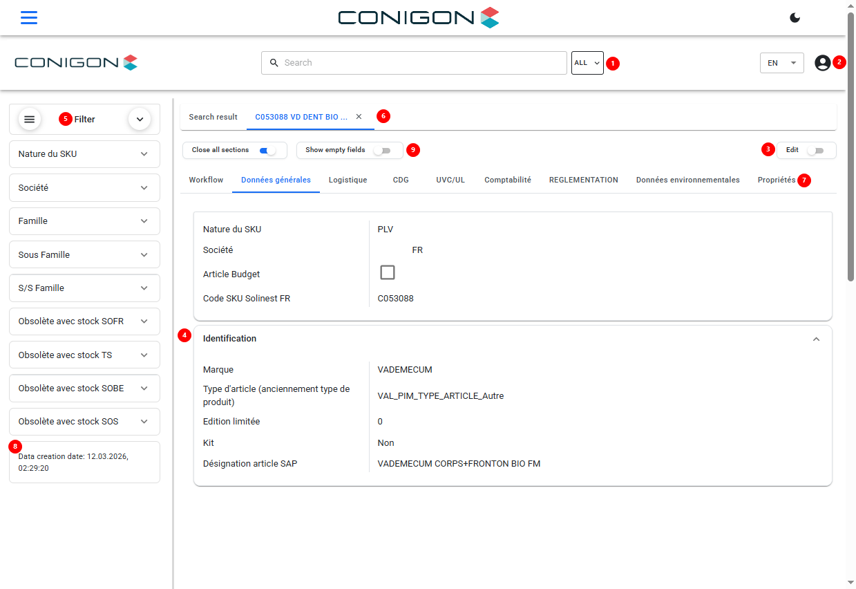
* (1) Search Field Selector
* Used to restrict the search to a specific field. The user can specify that they want to search only within a particular field.
* On click, a list opens. The entries in this list are defined in the CentralStation (by setting the “SEARCH” property on the Step-Positions—details below).
* (2) User Menu
* Allows the user to choose the language (if the portal is configured for it) and provides access to, among other things:
* Share table (if configured)
* Comparison list
* Download table
* Excel import (only for an Edit Portal and if configured)
* Logging data (“Edit-Logs”) (only for an Edit Portal and if configured)
* Template Designer – for dynamically generated PDF templates
* Settings (e.g., language selection and user login), if the portal is configured accordingly
* (3) Edit allows user to toggle to edit the data.
* (4) Sections within the Product Detail View. Sub-groups of fields inside each tab. This is configurable with in the CeSt.
* (5) Filter Menu via Facets or Tree View
* Facets are generated automatically for fields to which the “FACET” property has been assigned on the Step-Positions (details below).
* The user can hide the entire filter panel or close individual facets via the icons.
* Tree view displays a hierarchical view of the data model.
* (6) Displays products currently opened in detail view as clickable items, so the user can jump between them easily without re-running a search.
* (7) Tabs of the Product Detail View
* Fields (“Step-Positions”) coming from the source and to be transferred into the portal can be organized into tabs and sections for display. This allows grouping fields logically or thematically.
* (8) Information on Last Full Content Update
* Indicates when the portal contents (e.g., products) were last fully updated. Typically, ADIB is configured to regenerate content once or multiple times per day automatically.
* (9) Allows users to toggle to close all sections and to show only empty fields.
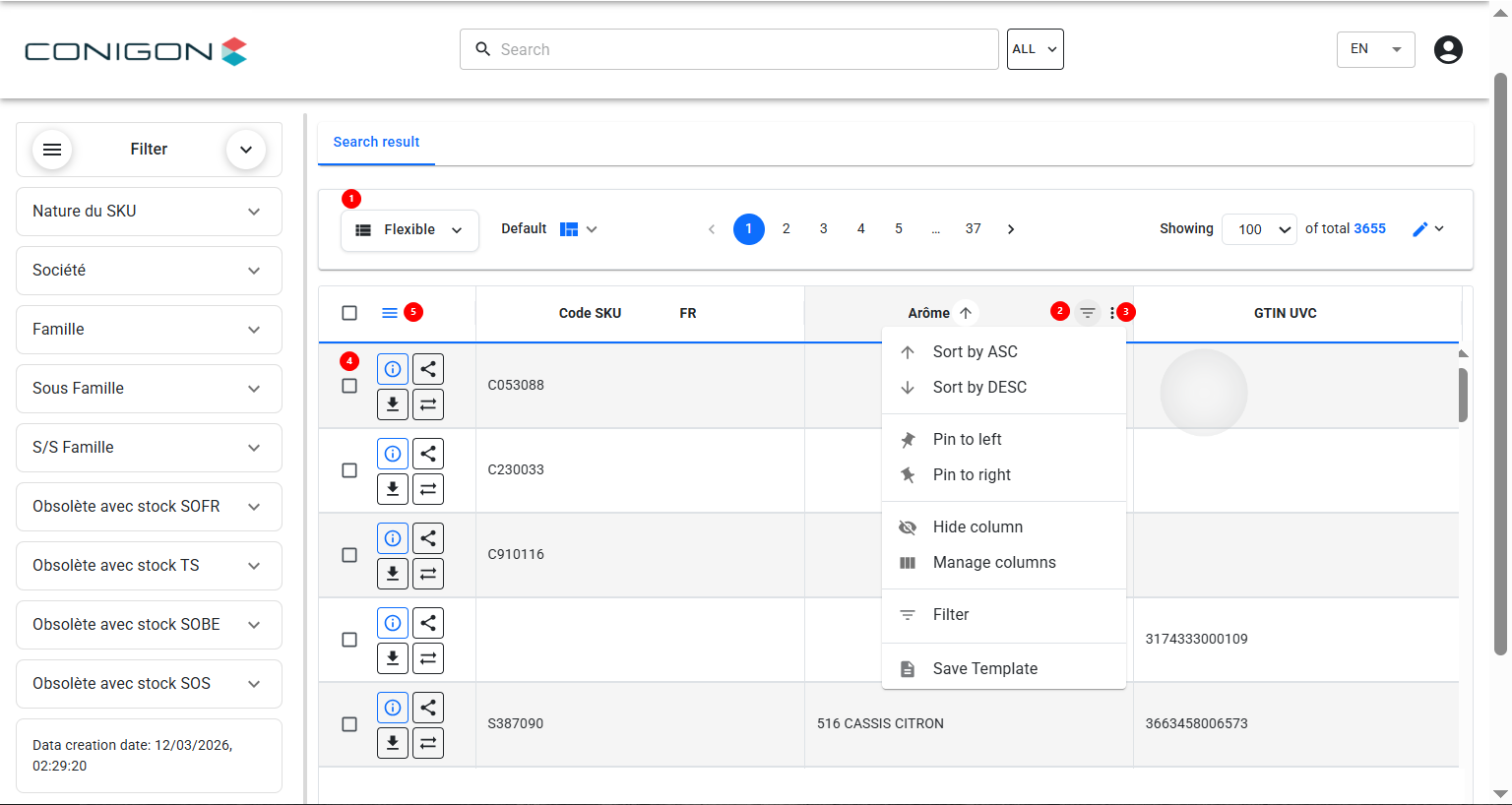
* (1) Column Headers Acting as Filters
* In the “FLEXIBLE” view (see item 6), clicking on a column header (e.g., “Manufacturer” as shown) opens a list of all existing values along with their result counts. This allows the user to filter very easily, similar to Excel.
* (2) Column Filter : users can search and filter results.
* (3) Column Options : users can sort results by ascending or descending order, they can also pin columns to the right, left, they can hide, manage, filter or save templates.
* (4) Product Information Options :
* Information icon directs users to product information
* Share icon leads to a pop up window where users can copy a link to the product.
* Download Icon allows users to download product information
* Compare icon allows users to compare two products.
* (5) allows columns to be rearranged.
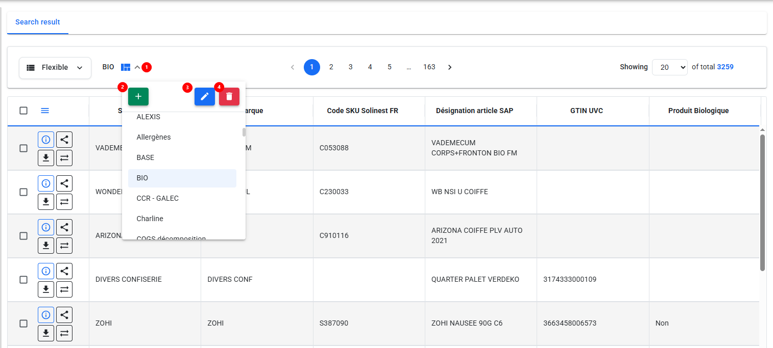
Flexible View Templates
In the flexible view you can have different templates of column order and selection.
- Press on the arrow button to view the different templates available.
- Press on the green '+' in order to create a new template.
- Once a template is selected you can edit it by pressing on the pencil icon.
- Press on the red trash can to delete a template.
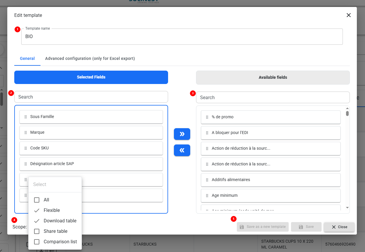
Creating a new template
To create a new template follow the steps below.
- You can enter a name for your template.
- Selected fields are all the fields you have selected to be in your view. To remove an attribute that is already in your view simply drag and drop it into the available fields column.
- Available fields include all the available attributes for this particular order. To select a new attribute for your template search for it in the available fields and then drag and drop it into your selected fields.
- Press on scope at the bottom of the screen in order to select where you would like this template to be available : flexible view, download table, share table, comparison list, or all of these options.
- You can save as a new template, save or close the window.